 CHELSEA'S PORTFOLIO
Brand Strategy
According to Forbes, 55% of audiences say they are uncomfortable with artificial intelligence. I witnessed this first hand.
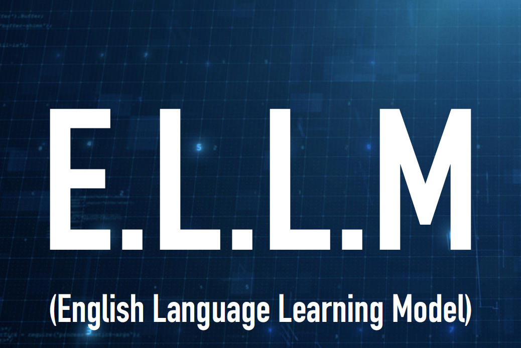
When I first came up with the idea for Grasp, I pitched the concept as "ELLM", or the English Language Learning Model. I branded it using classic blue tech branding.
When I presented this project in ways that were technology forward, I lost the room, but when I focused on student stories I noticed that people tuned in more. No one wants another random tech product, so showing the unique use case and benefit of the product was key for this project. The branding reflects the use case of uplifting English language learning students through warm design language.
Before
After
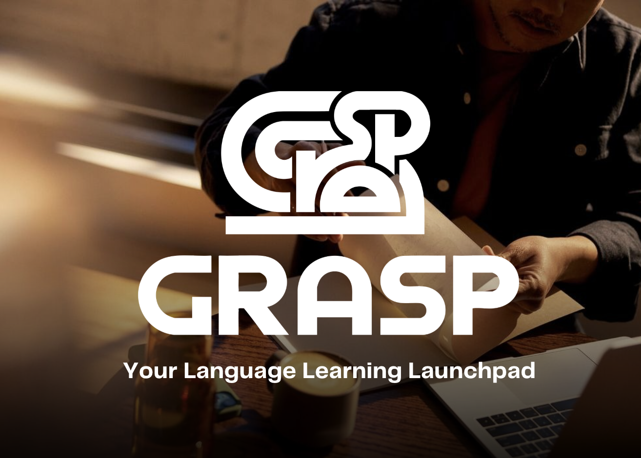
ELLM, the blue tech original, next to Grasp after the rebrand.
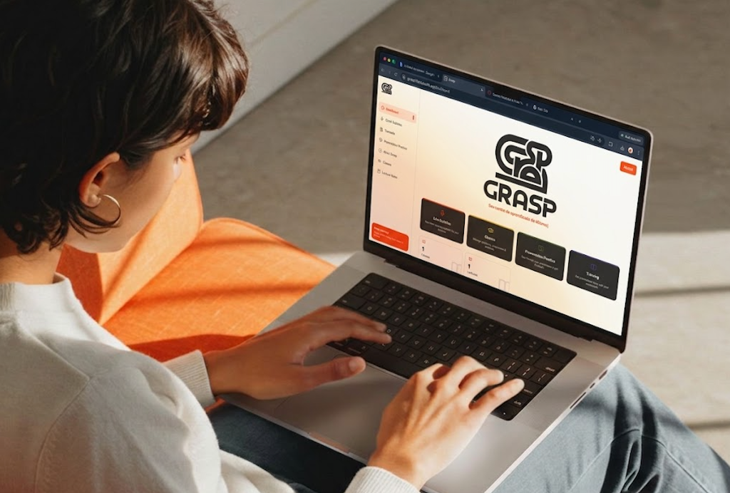
Grasp Visual Identity
Who Is Grasp?
Grasp is free academic support for adult English language learners. It strengthens a student's own effort instead of replacing it, bridging the gap between listening and comprehension. While other tools sell technology, Grasp shows what students can do with the right support.
Brand Values
Be people first
We operate to advance equity, and to remove barriers to education.
Respect the student
We always treat the student as an intellectual equal.
Give agency
We are here to foster independence rather than creating a crutch.
Humility
We adapt to the student, so they never have to assimilate to machine logic.
Tone of Voice
More This
Empowering
Credible
Engaging
Candid
Creative
Approachable
Less This
Corny
Clinical
Childish
Vulgar
Artsy
Unprofessional
The Logo
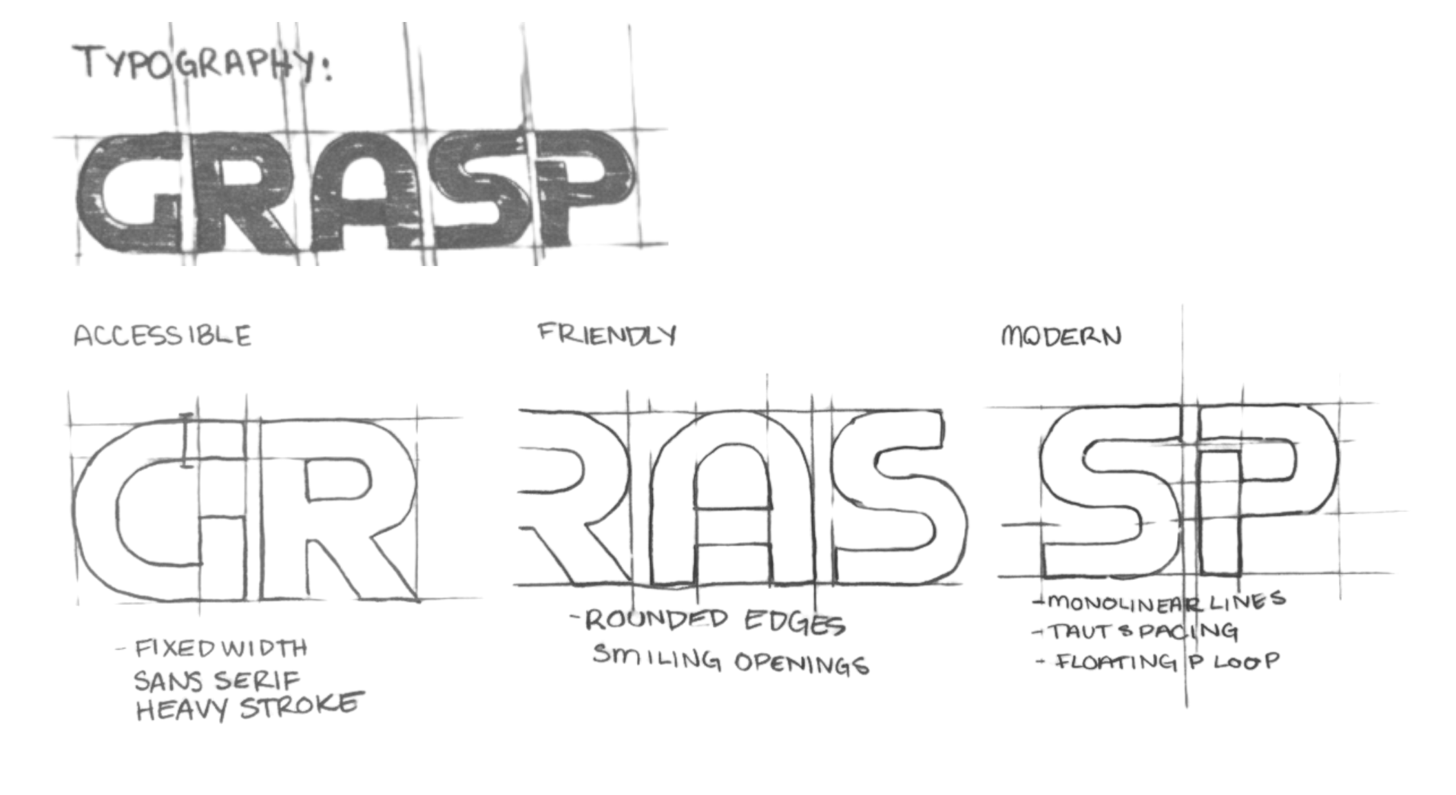
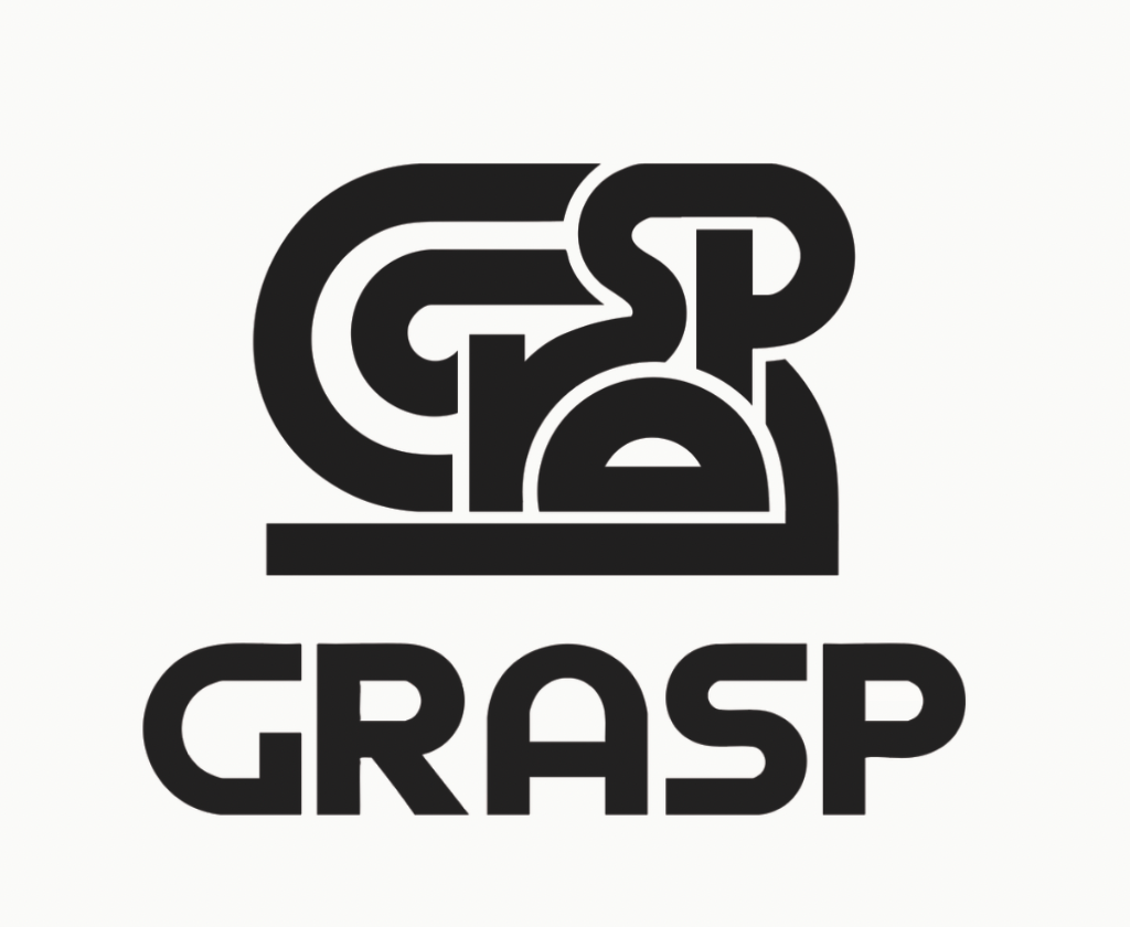
The Grasp tangle is built to look like an almost readable word. It is the feeling of recognizing language before you fully understand it.
GRASP sits beneath it in a matching line weight, translating the lines above. The mark performs the product.
Typeface Development
Secondary Mark
The tangle crowds at small sizes. In micro-formats like tab icons, subtle watermarks or profile avatars, we switch to the secondary mark so the idea survives the scale.
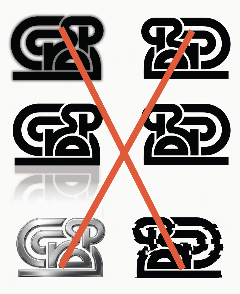
Logo No-Go's
To stay consistent, we stay true to the logo's official variations at all times. Never tilt it, never distort it. No drop shadows, no outlines, no filters.
Logo Animation
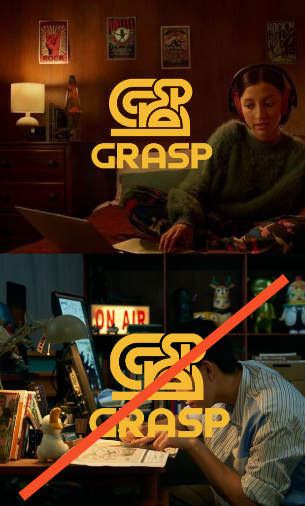
Logo Over Images
The logo can be used over images when there is space for it to stay fully legible. Color is picked from the nearest approved combination to ensure accessibility and clarity.
Photography
Warm, crisp and focused. The camera stays close to the work and the moments around it.
Subjects appear focused, frustrated or relieved, never posed. Natural light, real materials and purposeful framing keep the images human and professional.
Typography
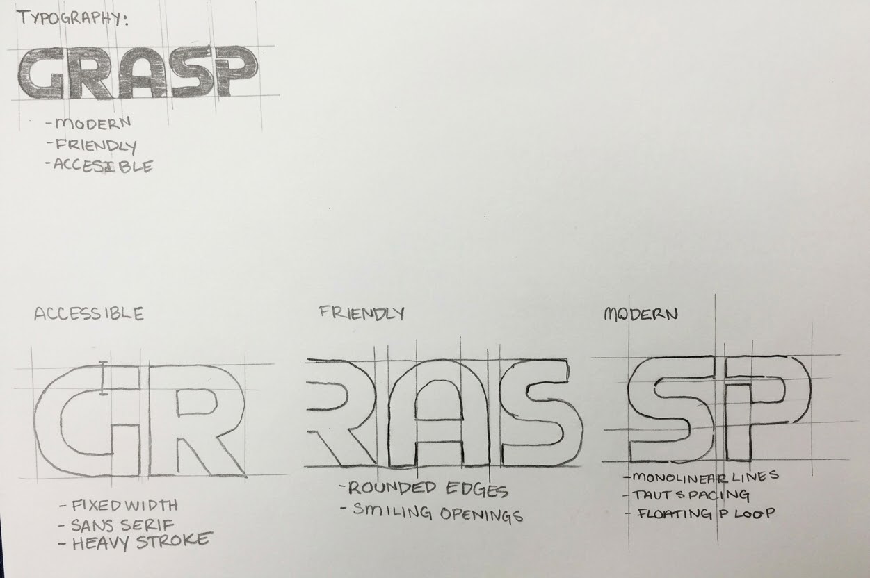
Cal Sans was chosen for a friendly face and high readability. Figtree carries the body.
Headline — Cal Sans 80
Subhead — Cal Sans 40
Body — Figtree 32
Grasp's Graphic Design is...
Clean.
Creative.
Upbeat.
When in doubt, remove, don't add.
Color Experience
Purple.
White, charcoal and tangerine create a sharp, professional base. Deliberate color adds humanity to the academic frame.
Purple is the accent, not the wallpaper. It replaces cold tech blue with something warmer and more human.
Primary palette
Purple
#52478b
PANTONE 7671 C
Snow White
#fbfbf7
PANTONE 11-0602 TCX
Charcoal
#2f2e2c
PANTONE Process Black C
Supporting palette
Peach
#fda38b
PANTONE 1625 C
Amber
#f1b732
PANTONE 7409 XGC
Signal
#fc4716
PANTONE 172 C
Olive
#5f6939
PANTONE 5753 C
Grasp · Brand Identity|Back to Work